install.packages("geocausal")
devtools::install_github("mmukaigawara/geocausal", dependencies = TRUE)geocausal: An R Package for Spatio-Temporal Causal Inference
Installation
The geocausal package is an open-source R package. It is available through the Comprehensive R Archive Network (CRAN) at https://cran.r-project.org/package=geocausal. Users can find a GitHub repository at https://github.com/mmukaigawara/geocausal where they can report bugs, requests, and other issues. To install the geocausal package, users can use either of the following commands:
Functions
The geocausal package consists of two types of functions. The first set of functions prepares data for spatio-temporal causal inference. These functions convert data with spatio-temporal dimensions to point pattern data or pixel images. Users can also employ these functions to transform spatial covariates, such as distances from certain locations. The second set of functions are for estimation of causal effects. They are designed for acquiring multiple densities that describe the spatial distribution of events. Additionally, the summary() and plot() functions assist users in summarizing and visualizing both intermediate results and final estimates.
Data
The package has two built-in datasets: airstrikes and insurgencies. These datasets represent the spatiotemporal data of airstrikes and insurgent attacks in Iraq from February 2007 to July 2008. The datasets consist of four columns: date, longitude, latitude, and type.
| Variable | Description |
|---|---|
date |
Dates of airstrikes or insurgent attacks in class Date |
longitude |
Longitudes of airstrikes or insurgent attacks in decimal degree as numerics |
latitude |
Latitudes of airstrikes or insurgent attacks in decimal degree as numerics |
type |
Types of airstrikes or insurgent attacks. For airstrikes, it is either Airstrikes or SOF (shows of force). For insurgent attacks, it is either SAF (small arms fire) or IED (improvised explosive devices). |
There are two crucial steps that need to be applied to the location and time variables. First, location information must be converted to the decimal degree format. For example, the location of the center of Baghdad in Iraq should be expressed as (latitude, longitude) = (33.3135, 44.361). When using geocausal, users should make the necessary conversion if the original data are in a different format such as degrees (e.g., (33° 18′ 46″, 44° 21′ 41″)). To convert coordinates, users can employ external packages, such as the sf_project() function of the sf package.
Second, while the time variable date in the datasets is of the Date class, it needs to be converted to an integer form before using the package geocausal. For example, if users’ dataset has a time variable ranging from 2020-01-01 to 2020-01-31, then it is recommended that they convert it to integers ranging from 1 to 31. Provided the time variable is in an integer format, users can work with various time scales, including dates, hours, weeks, and months.
In addition to the two datasets, we also use two other built-in datasets: iraq_window and airstrikes_base. The iraq_window data is an owin object and defines the area of interest. Owin objects are primarily used in the spatstat package, and since the geocausal package is dependent upon the spatstat package, users are advised to acquire an owin object that defines their geographical area of interest. For example, users can convert shapefiles into an owin object using the get_window() function of the geocausal package. The airstrikes_base data contains the date and location information of airstrikes that occurred in Iraq during a part of year 2006. We utilize this separate dataset to construct counterfactual distributions, while the main dataset is used to estimate causal effects.
Overview
To demonstrate the use of our package, we estimate the causal effects of airstrikes on insurgent attacks in Iraq. First, we prepare the data by transforming the raw data into a specialized class of objects known as hyperframes, refining the point pattern outcome data, and transforming the necessary covariates. Second, we estimate causal effects by estimating the propensity score and defining counterfactual densities. We can also analyze heterogeneous treatment effects. Visualizing each step is essential in understanding and appropriately implementing spatio-temporal causal inference.
| Data preparation |
|---|
| Step 1. Acquiring a hyperframe |
| Converting data into a hyperframe |
| Spatial smoothing of the outcomes |
| Step 2. Transforming covariates |
| Transforming point pattern data |
| Acquiring treatment and outcome histories |
| Transforming polygon data |
| Transforming non-spatial covariates |
| Estimation of causal effects |
| Step 1. Estimating propensity scores |
| Acquiring the density of observed treatment data |
| Performing out-of-sample prediction |
| Step 2. Estimating causal effects |
| Obtaining the baseline density |
| Specifying counterfactual densities: Changing the expectation |
| Specifying counterfactual densities: Shifting locations |
| Assessing the effect of prioritization |
| Interpreting counterfactual densities |
| Obtaining causal contrasts |
| Performing heterogeneity analyses |
Data Preparation
The first step of spatio-temporal causal inference involves preparation of data. We first acquire a hyperframe by converting location information into images (i.e., maps). We then transform covariates of various forms.
Step 1. Acquiring a Hyperframe
Coordinate projection
Coordinate projection is essential to accurately account for the Earth’s curvature. Without proper projection, spatial metrics can be misspecified. The geocausal package automatically projects geodetic coordinates into appropriate projected coordinate systems.
When generating a window object via the get_window() function, users can define a coordinate reference system (CRS) by manually setting the target_crs argument to a specific European Petroleum Survey Group (EPSG) code or by allowing the function to identify an optimal system automatically. This automated selection is enabled by the suggest_crs() function from the crsuggest package. The resulting window object stores the CRS information as an internal attribute. For instance, the iraq_window dataset included in this package utilizes EPSG 6646 (the Karbala 1979 / Iraq National Grid).
Because most spatiotemporal analyses in social science and conflict research are conducted at the kilometer scale, get_window() defaults to kilometers as the base unit. Users can modify this using the unit_scale argument, which defines the divisor applied to the standard meter value. For example, to maintain the window in meters rather than kilometers, users would set the scale to 1.
iraq_window_meters <- get_window(load_path = "path_to_shapefile",
                                 unit_scale = 1)
The CRS information stored within the window object is used across all subsequent stages of analysis. For example, when using the get_hfr() function, users provide coordinate data in the form of longitudes and latitudes, which the function projects onto the specific coordinate system of the provided window. Consistent with the get_window() function, users can also adjust the unit_scale to ensure spatial measurements align with their needs. To ensure mathematical consistency and avoid errors in spatial calculations, it is essential that users maintain the same unit_scale throughout the entire analytical workflow.
Converting Data into a Hyperframe
We first transform the locations of treatment and outcome events into a point pattern format. The goal here is to create maps that represent the locations of both airstrikes and insurgent attacks. If some dates have no events, an empty map should be created. The key function used for this procedure is get_hfr().
We will use the built-in data of airstrikes and insurgent attacks, as well as the out-of-sample data from 2006. They are saved as airstrikes, insurgencies, and airstrikes_2006. After loading the geocausal package, users can use these datasets by just specifying them. For simplicity, let us rename the datasets first. We also remove data points that are outside of the iraq_window.
airstr <- airstrikes
insurg <- insurgencies
airstr_2006 <- airstrikes_2006

filter_inside_window <- function(data, window = iraq_window) {

  window_crs <- attr(window, "crs")

  data_sf <- sf::st_as_sf(data, coords = c("longitude", "latitude"), crs = 4326)
  data_proj <- sf::st_transform(data_sf, window_crs)
  coords_km <- sf::st_coordinates(data_proj) / 1000

  inside <- spatstat.geom::inside.owin(coords_km[, 1], coords_km[, 2], window)

  cat("Filtered:", sum(!inside), "points removed,", sum(inside), "points kept\n")
  return(data[inside, ])
}

airstr <- filter_inside_window(airstr)
insurg <- filter_inside_window(insurg)
airstr_2006 <- filter_inside_window(airstr_2006)
To use the get_hfr() function, users must specify the data, the names of the time and location variables, the time periods of interest, and a window object. Additionally, as described in the Data table above, both airstr and insurg include a variety of events. In the case of the airstr dataset, both airstrikes and SOF are included. In the insurg dataset, we have SAF and IED. Since substantive interpretations of these events vary, we need to acquire separate point patterns for each of the event “types” (i.e., airstrikes and SOF for the airstr dataset, and SAF and IED for the insurg dataset). However, users may also want to create point patterns that incorporate all types of events (i.e., both SAF and IED as one point pattern). To do so, users can set combine = TRUE and the get_hfr() function will acquire a separate point pattern that includes all the locations of every event.
The following code converts the date column into an integer format.
airstr$time <- as.numeric(airstr$date - min(airstr$date) + 1)
insurg$time <- as.numeric(insurg$date - min(insurg$date) + 1)
We then acquire point patterns using the airstr and insurg datasets.
treatment_hfr <- get_hfr(data = airstr, col = "type", window = iraq_window,
                         time_col = "time", time_range = c(1, 499),
                         coordinates = c("longitude", "latitude"),
                         combine = FALSE)
outcome_hfr <- get_hfr(data = insurg, col = "type", window = iraq_window,
                       time_col = "time", time_range = c(1, 499),
                       coordinates = c("longitude", "latitude"),
                       combine = TRUE)
We now combine the two hyperframes to generate one hyperframe object. We remove the first column of outcome_hfr because it is a time column and the same as the first column of treatment_hfr. Since the outcome hyperframe has point patterns that incorporate all events, we rename it as all_outcome.
dat_hfr <- spatstat.geom::cbind.hyperframe(treatment_hfr, outcome_hfr[, -1])
names(dat_hfr)[names(dat_hfr) == "all_combined"] <- "all_outcome"
Each element of the newly generated hyperframe, except for the time variable, is of class ppp. Columns represent point patterns for airstrikes, SOF, SAF, IED, all other insurgent attacks, and all outcomes combined (all_outcome). Each row represents each time period (day). To see this, users can run the usual head() function.
head(dat_hfr, n = 3)When using the geocausal package, users are advised to visualize every step. To visualize a hyperframe, users can use the plot() function. In the figure below, we visualize point patterns for airstrikes and all insurgent attacks on day 400 to see what the distribution of airstrikes looks like. Users can obtain this figure by executing the following code.
airstr_ppp <- dat_hfr$Airstrike
outcome_ppp <- dat_hfr$all_outcome
ggpubr::ggarrange(
  plot(airstr_ppp, frame = 400, main = "Airstrikes"),
  plot(outcome_ppp, frame = 400, main = "Insurgent activities"))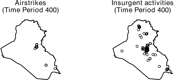
Spatial Smoothing of the Outcomes
We next perform spatial smoothing of the outcomes. If the outcomes are raster objects, users can bypass this process. To accomplish this task, we employ the smooth_ppp() function. The function has two primary arguments. The first is data, which refers to an outcome variable column of the hyperframe that was obtained as described above. The second is method, which determines the smoothing method. Two options are currently available: mclust and abramson.
The Gaussian mixture model (specified by method = "mclust") offers a simple approach to smoothing point patterns. It performs model-based clustering of points by determining the common variance term and then using this variance for the isotropic smoothing kernel. Thus, it pools spatial information across the entire study period and ensures that the smoothing bandwidth is informed by the global distribution of events. A primary advantage of the Gaussian mixture model is its computational efficiency. To further accelerate this process, users can set the sampling argument. By doing this, the smooth_ppp() function will use a fraction of the data to estimate the common variance. For instance, to use 5% of the data (specified by setting sampling = 0.05) for initialization and spatially smooth the columns of all outcome events, users can execute the following code. Throughout this paper, we create 256 x 256 image objects by setting ndim = 256. Instead of setting the number of pixels, users can specify the resolution argument, which represents the width of pixels in physical distance. For example, if users set resolution = 5, then the resulting images consist of 5 x 5 km² grid cells.
dim <- 256

smooth_allout_mcl <- smooth_ppp(data = dat_hfr$all_outcome,
                                method = "mclust", sampling = 0.05,
                                ndim = dim)
Whereas the Gaussian mixture model is a computationally efficient approach to smoothing point patterns, users should note that it uses a fixed bandwidth. This method can pose problems when the true outcome process varies substantially across regions. To account for this variation, it is preferable to use adaptive smoothing techniques.
To execute adaptive smoothing, the smooth_ppp() function adopts the method proposed by Abramson (1982). The geocausal package assumes that the bandwidth is inversely proportional to the square root of the target densities. Users can apply this adaptive-bandwidth approach by setting method = "abramson". For example, to smooth the locations of insurgent attacks, users can execute the following code.
smooth_allout <- smooth_ppp(data = dat_hfr$all_outcome,
                            method = "abramson", ndim = dim)
smooth_IED <- smooth_ppp(data = dat_hfr$IED,
                         method = "abramson", ndim = dim)
smooth_SAF <- smooth_ppp(data = dat_hfr$SAF,
                         method = "abramson", ndim = dim)
We compare smoothing based on the Gaussian mixture model with adaptive smoothing. Although both approaches assign high density to Baghdad, their numerical values differ (see the figure below, shown on the log scale), indicating that the choice of smoothing method can affect estimated causal quantities. In general, unless the spatial distribution of outcome events can be assumed to be similar across geographic areas, adaptive smoothing is preferable. In our application, insurgent events are concentrated in politically salient locations, such as densely populated settlements and military bases, which makes adaptive smoothing more appropriate. All subsequent results in this paper rely on the adaptive smoothing approach.
ggpubr::ggarrange(
  plot(smooth_allout_mcl, frame = 400, transf = log,
       lim = c(-30, 10), main = "Gaussian"),
  plot(smooth_allout, frame = 400, transf = log,
       lim = c(-30, 10), main = "Abramson"),
  common.legend = TRUE, legend = "bottom")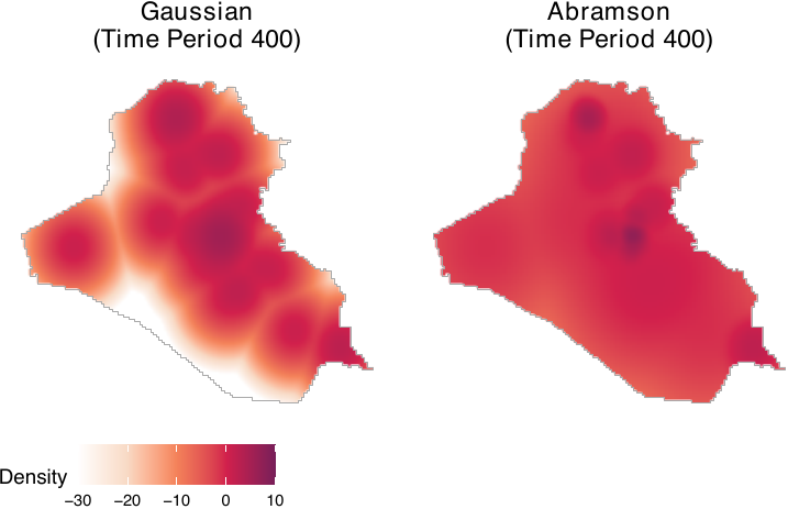
The following code saves the smoothed objects as columns of the dat_hfr hyperframe.
dat_hfr$smooth_allout_mcl <- smooth_allout_mcl
dat_hfr$smooth_allout <- smooth_allout
dat_hfr$smooth_IED <- smooth_IED
dat_hfr$smooth_SAF <- smooth_SAF
Since the process of smoothing is computationally demanding, we recommend that users save the output to avoid running the process multiple times. To save the output, users can execute the saveRDS() function.
saveRDS(dat_hfr, file = "dat_hfr.rds")The output consists of a list of pixelated images, each representing the smoothed outcomes for each time point.
Step 2. Transforming Covariates
To model the distribution of treatment events and account for confounding factors, it is essential to incorporate an appropriate set of covariates. Spatial covariates can take the form of point patterns, polygons, or image (raster) objects. Users may need to transform spatial covariates to best model the spatial distributions of the treatment.
Point patterns are commonly used to calculate distances from event locations. For instance, we utilize distances from cities, settlements, and the locations of previous airstrikes and insurgent attacks as spatial covariates to model the treatment density. To achieve this, users are advised to convert location information into point patterns and then calculate the distances from each location. An extension of point pattern data includes line segments, such as the locations of rivers and roads. Distances from rivers and roads are also used to model the density of airstrikes.
Polygon data assign values to specific geographical areas. For instance, we utilize log population and aid spending in each district as spatial covariates to model the treatment density. To acquire polygon data, users are advised to assign values of interest, such as log population, to predefined geographical polygons.
Although we do not use image data in our example, it is possible to employ them as well. Examples of image data include satellite images and population density data represented as image objects. To utilize such data, users need to load it and then convert it into an im object compatible with the spatstat package.
In the following example, we use the covariates listed in the table below. Distances from rivers, roads, cities, and settlements, originally available as location information (point patterns or line segments), are calculated. These distances are then converted by applying an exponential decay function (\(\exp(-c \times \text{distance})\) where \(c\) is a constant). Log population and aid spending, represented as polygon data, assign values corresponding to population and aid spending to each polygon (administrative region). Treatment and outcome histories, available as point patterns, are utilized to calculate distances from each location. All of the aforementioned covariates are used by Papadogeorgou et al. (2022), with the exception of an indicator variable for a surge of airstrikes. It is important to note that to accurately replicate the results of Papadogeorgou et al. (2022), users should use an older version of the spatstat package (version 1.63-3).
Covariates for Modeling the Treatment Density
| Covariates | Description |
|---|---|
| Point patterns | |
| Distance from rivers | Distance (exponential decay) from rivers |
| Distance from roads | Distance (exponential decay) from roads |
| Distance from all major cities | Distance (exponential decay) from cities |
| Distance from settlements | Distance (exponential decay) from settlements |
| Treatment and outcome history | History of airstrikes, insurgent attacks, and SOF (1-day, 7-day, and 30-day history) |
| Polygons | |
| Log population | Population (log count) in each district |
| Aid spending | Aid spending in each administrative region |
| Miscellaneous | |
| Splines of time | Three time splines |
| Indicator for a surge | An indicator for a surge of airstrikes (between March 25, 2007 and January 1, 2008) |
Transforming Point Pattern Data
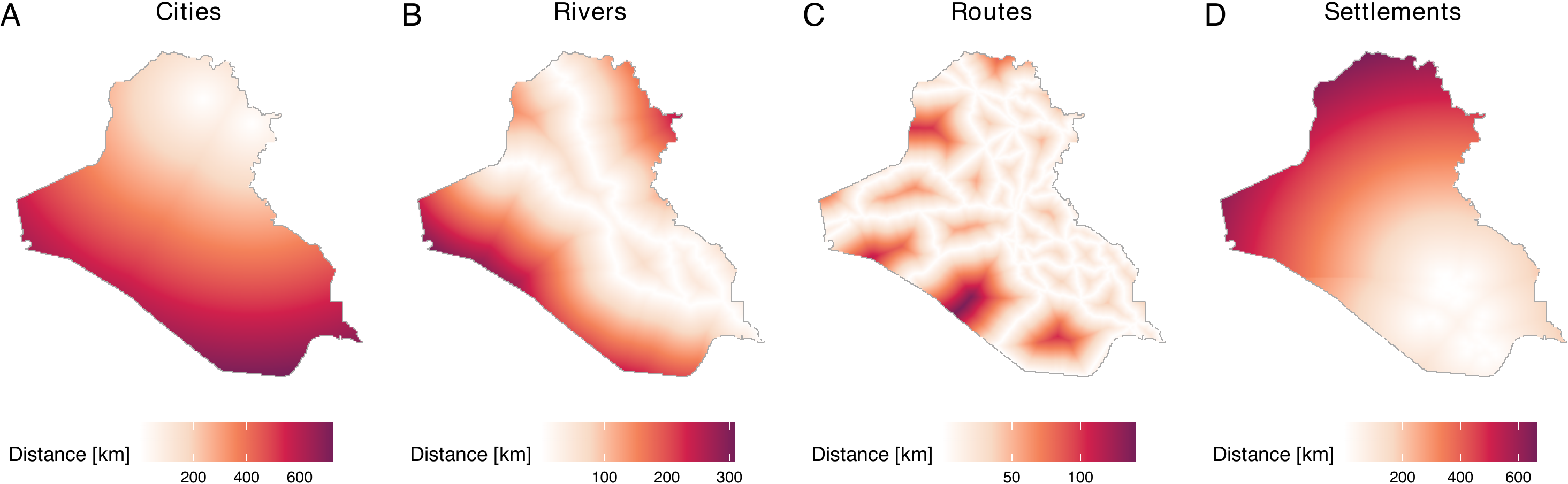
All raw distance-related covariates are available to users in our repository. To load data from the repository, users can execute the following code. The loaded dataset, cities_dist, rivers_dist, routes_dist, and settle_dist, represent raw distances from cities, rivers, roads, and settlements.
cities_dist <- dataverse::get_dataframe_by_name(
  filename = "cities_dist.rds", dataset = "doi:10.7910/DVN/IU8RQK",
  server = "dataverse.harvard.edu", .f = readRDS, original = TRUE)

rivers_dist <- dataverse::get_dataframe_by_name(
  filename = "rivers_dist.rds", dataset = "doi:10.7910/DVN/IU8RQK",
  server = "dataverse.harvard.edu", .f = readRDS, original = TRUE)

routes_dist <- dataverse::get_dataframe_by_name(
  filename = "routes_dist.rds", dataset = "doi:10.7910/DVN/IU8RQK",
  server = "dataverse.harvard.edu", .f = readRDS, original = TRUE)

settle_dist <- dataverse::get_dataframe_by_name(
  filename = "settle_dist.rds", dataset = "doi:10.7910/DVN/IU8RQK",
  server = "dataverse.harvard.edu", .f = readRDS, original = TRUE)
The figure below summarizes the data. Distances are recorded in kilometers.
While we have created distance data and saved these in our repository, users can also acquire distances from user-defined locations. To do so, users can employ the get_dist_focus() and get_dist_line() functions. The get_dist_focus() function calculates distances from a point and the get_dist_line() calculates distances from a line or polygon. For example, if users want to calculate distances from the center of Baghdad, they can do so by employing the get_dist_focus() function (see figure below) by specifying the longitude and latitude, the dimensions or resolutions, and a window object (in this case, iraq_window, which is provided in the geocausal package). The code that calculates distances from Baghdad, obtains a 256 x 256 image, and creates the figure is as follows.
dist_baghdad <- get_dist_focus(window = iraq_window, ndim = 256,
                               lon = 44.366, lat = 33.315)
plot(dist_baghdad, main = "Distance from Baghdad",
     scalename = "Distance [km]")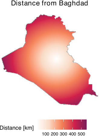
After loading or acquiring distance data, users may wish to convert raw distances by applying exponential decay functions. This transformation is particularly useful when there is a need to prioritize the vicinities of certain locations based on their sizes and substantive importance. This is because the use of raw distances can present two critical issues. The first issue is that areas distant from cities register higher values than those close to cities. This becomes problematic for users who wish to prioritize the vicinities of cities. In our example, since areas close to cities are more likely to be targeted by airstrikes, our goal is to prioritize vicinities of cities over areas far from them. The second issue is that the differences between large and small cities are not adequately captured by raw distances. For instance, using raw distances does not allow users to consider the sizes of cities.
To address these issues, we employ an exponential decay function. The figure below, which is obtained by the code below, demonstrates the conversion of raw distances by exponential decay functions. In our package, distance metrics are calculated in kilometers using the Iraq National Grid projection. In this paper, they are subsequently normalized by a conversion factor of 111.3195 to represent distances in degree-equivalents to ensure consistency with the spatial unit scale used by Papadogeorgou et al. (2022). For large cities, we multiply the raw distances by -4 and exponentiate the result (panel A). For small cities, we use -10 instead of -4 (panel B).
dist_large_cities <- cities_dist$distance[2]
dist_small_cities <- cities_dist$distance[4]
conversion_factor <- 111319.5 / 1000
ggpubr::ggarrange(
  plot(dist_large_cities, lim = c(0, 1),
       transf = function(x) exp(-4 * x / conversion_factor),
       scalename = "Distance") +
    ggtitle("Large cities \n(Population: 500k-1m)"),
  plot(dist_small_cities, lim = c(0, 1),
       transf = function(x) exp(-10 * x / conversion_factor),
       scalename = "Distance") +
    ggtitle("Small cities \n(Population: 50-100k)"),
  labels = LETTERS, common.legend = TRUE, legend = "bottom")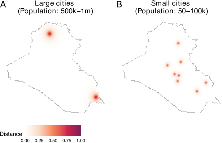
As we can see, this transformation allows us to prioritize the vicinities of cities while considering the varying sizes of cities. In many cases, exponential decay functions can provide users with more substantively meaningful covariates than raw distances. We assign a coefficient of -3 for rivers and roads.
exp_rivers_dist <- exp(-3 * rivers_dist / conversion_factor)
exp_routes_dist <- exp(-3 * routes_dist / conversion_factor)

dat_hfr$rivers_dist <- exp_rivers_dist
dat_hfr$routes_dist <- exp_routes_dist
For cities, depending on their population, we use coefficients of -2, -4, -6, -8, and -10. We then compile distances from all cities into a single image object.
cities_dist <- lapply(1:5, function(x) {
  exp(-(2 * x) * cities_dist$distance[[x]] / conversion_factor)
})
all_cities <- cities_dist[[1]] + cities_dist[[2]] +
  cities_dist[[3]] + cities_dist[[4]] + cities_dist[[5]]

dat_hfr$all_cities <- all_cities
A coefficient of -12 is used for settlements. We save distances from settlements in each governorate separately, which results in 18 distinct image objects representing distances from settlements.
settles <- lapply(1:18, function(x) {
  exp(-12 * settle_dist$distance[[x]] / conversion_factor)
  })

for (jj in 1 : 18) {
  dat_hfr$settles <- settles[[jj]]
  col_name <- paste0("settles_dist_", jj)
  names(dat_hfr)[length(names(dat_hfr))] <- col_name
}
Acquiring Treatment and Outcome Histories
Another important source of point pattern data is the history of treatment and outcome data. Since our aim is to model the density of airstrikes, it is crucial to consider the histories of both airstrikes and insurgent attacks, which should drive the strategic deployment of airstrikes. Specifically, we require 1-day, 7-day, and 30-day histories of airstrikes, insurgent attacks, and SOF on a daily basis.
To obtain histories of airstrikes, insurgent attacks, and SOF, users can employ the get_hist() function. This function acquires a point pattern of histories by obtaining histories of user-defined events within a user-specified range (e.g., 7-day histories of airstrikes) and saves them as point pattern data. By combining the get_hist() function with the standard lapply() function, we can obtain point pattern data of histories of insurgent attacks as follows. In the following code, hist_allout_1_pp represents a list of point patterns of 1-day histories of insurgent activities. Histories of airstrikes and SOF as point patterns can be obtained similarly.
get_out_hx <- function(timeint, out, window, lag) {
  temp <- lapply(timeint, get_hist, Xt = out, lag = lag, window = window)
  purrr::map(temp, 1)
}

hist_allout_1_pp <- get_out_hx(timeint = dat_hfr$time,
                               out = dat_hfr$all_outcome,
                               window = iraq_window, lag = 1)
hist_allout_7_pp <- get_out_hx(timeint = dat_hfr$time,
                               out = dat_hfr$all_outcome,
                               window = iraq_window, lag = 7)
hist_allout_30_pp <- get_out_hx(timeint = dat_hfr$time,
                                out = dat_hfr$all_outcome,
                                window = iraq_window, lag = 30)

hist_airstr_1_pp <- get_out_hx(timeint = dat_hfr$time,
                               out = dat_hfr$Airstrike,
                               window = iraq_window, lag = 1)
hist_airstr_7_pp <- get_out_hx(timeint = dat_hfr$time,
                               out = dat_hfr$Airstrike,
                               window = iraq_window, lag = 7)
hist_airstr_30_pp <- get_out_hx(timeint = dat_hfr$time,
                                out = dat_hfr$Airstrike,
                                window = iraq_window, lag = 30)
Users should notice that the history data is saved as point patterns. However, just like distances from rivers and roads, we are interested in whether the vicinities of locations of previous airstrikes and insurgent attacks can help predict the density of airstrikes. Hence, we need to convert the point pattern data of histories into images of distances. To achieve this, we can implement the following code. In the following example, we use an exponential decay function with a coefficient of -6. Histories of airstrikes and SOF can be acquired in a similar manner.
get_prior_hist <- function(x, prior_coef, window, ndim = 256) {

  dist_mp <- spatstat.geom::distmap(x, dimyx = c(ndim, ndim))
  dims <- dim(dist_mp$v)
  if (length(unique(as.numeric(dist_mp$v))) == 1) {
    dist_mp$v <- matrix(Inf, nrow = dims[1], ncol = dims[2])
  }

  conversion_factor <- 111319.5 / 1000

  prior_hx <- exp(- prior_coef * dist_mp / conversion_factor)
  spatstat.geom::Window(prior_hx) <- window

  return(prior_hx)
}

hist_allout_1 <- lapply(hist_allout_1_pp, get_prior_hist,
                        prior_coef = 6, window = iraq_window)
hist_allout_7 <- lapply(hist_allout_7_pp, get_prior_hist,
                        prior_coef = 6, window = iraq_window)
hist_allout_30 <- lapply(hist_allout_30_pp, get_prior_hist,
                         prior_coef = 6, window = iraq_window)

hist_airstr_1 <- lapply(hist_airstr_1_pp, get_prior_hist,
                        prior_coef = 6, window = iraq_window)
hist_airstr_7 <- lapply(hist_airstr_7_pp, get_prior_hist,
                        prior_coef = 6, window = iraq_window)
hist_airstr_30 <- lapply(hist_airstr_30_pp, get_prior_hist,
                         prior_coef = 6, window = iraq_window)

hist_sof_1 <- lapply(hist_sof_1_pp, get_prior_hist,
                     prior_coef = 6, window = iraq_window)
hist_sof_7 <- lapply(hist_sof_7_pp, get_prior_hist,
                     prior_coef = 6, window = iraq_window)
hist_sof_30 <- lapply(hist_sof_30_pp, get_prior_hist,
                      prior_coef = 6, window = iraq_window)
The figure below illustrates 1-day, 7-day, and 30-day histories of airstrikes on day 400. Panel A presents the locations of airstrikes on the previous day, while panels B and C include locations of airstrikes over the past week and month, respectively. To create this figure, users can execute the following code.
ggpubr::ggarrange(
  plot(hist_airstr_1, frame = 400,
       main = "History (1-day)", scalename = "Distance"),
  plot(hist_airstr_7, frame = 400,
       main = "History (7-day)", scalename = "Distance"),
  plot(hist_airstr_30, frame = 400,
       main = "History (30-day)", scalename = "Distance"),
  nrow = 1, labels = LETTERS, common.legend = TRUE, legend = "bottom")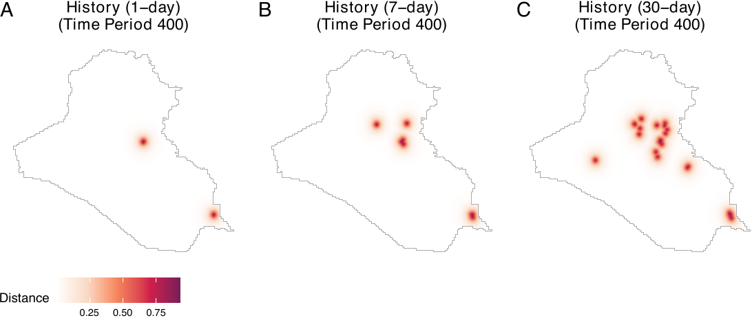
We now save all histories as columns of the hyperframe dat_hfr.
dat_hfr$hist_airstr_1 <- hist_airstr_1
dat_hfr$hist_airstr_7 <- hist_airstr_7
dat_hfr$hist_airstr_30 <- hist_airstr_30
dat_hfr$hist_allout_1 <- hist_allout_1
dat_hfr$hist_allout_7 <- hist_allout_7
dat_hfr$hist_allout_30 <- hist_allout_30
dat_hfr$hist_sof_1 <- hist_sof_1
dat_hfr$hist_sof_7 <- hist_sof_7
dat_hfr$hist_sof_30 <- hist_sof_30
Transforming Polygon Data
We use two polygon data: population and aid spending. Notice that aid spending is stored as a dataframe, with aggregated spending data available for each district and each day. Users can assign aid spending data to polygons of Iraqi local districts and create a map of Iraq with aid spending data.
Let us first load a shapefile of Iraq (iraq_dist_shapefile.rds) from our Dataverse repository as well as the aid spending data. For the district data, we add the CRS information so that it maintains the same CRS information as the window object.
iraq_district <- dataverse::get_dataframe_by_name(
  filename = "iraq_district.rds", dataset = "doi:10.7910/DVN/IU8RQK",
  server = "dataverse.harvard.edu", .f = readRDS, original = TRUE)
iraq_district <- sf::st_as_sf(iraq_district)
iraq_district <- sf::st_transform(iraq_district, 6646)

aid_district <- dataverse::get_dataframe_by_name(
  filename = "aid_district.rds", dataset = "doi:10.7910/DVN/IU8RQK",
  server = "dataverse.harvard.edu", .f = readRDS, original = TRUE)
We then assign aid spending data to each polygon. We also need to convert the acquired polygon data into an image object. This process must be repeated for all relevant time periods. To accomplish these tasks, let us first prepare an empty column to save the output.
dim <- 256
date_range <- seq(range(airstr$date)[1], range(airstr$date)[2], by = "1 day")
Then, we define the get_aid() function. This function extracts the aid spending data of all districts on each day (current_aid), assigns it to the polygon data (by joining the current_aid and iraq_district polygon data using the left_join() function), rasterizes the polygon with aid spending data, and transforms the raster data into im objects. Since rasterizing the polygon with aid spending data results in producing NAs in several cells at the border, we impute the values in such pixels by the mean in the neighboring pixels. We iterate this process over all time periods using the lapply() function.
get_aid <- function(i, na.correction = TRUE, na.method = "focal") {
  aid_oneday <- aid_district[which(aid_district$USE_DATE == date_range[i]),
                             c("District", "log_construct")]
  aid_oneday <- dplyr::left_join(iraq_district, aid_oneday,
                                 by = c("ADM3NAME" = "District"))
  aid_oneday$log_construct <- ifelse(is.na(aid_oneday$log_construct), 0,
                                     aid_oneday$log_construct)

  # Convert to km to match window units
  aid_oneday_km <- aid_oneday
  sf::st_geometry(aid_oneday_km) <- sf::st_geometry(aid_oneday) / 1000

  # Create raster using window extent (in km)
  ext <- terra::ext(c(iraq_window$xrange, iraq_window$yrange))
  r <- terra::rast(ext, nrow = dim, ncol = dim)
  r <- terra::rasterize(terra::vect(aid_oneday_km), r, field = "log_construct")

  # Apply NA correction for interior pixels only
  if (na.correction) {
    # Create mask of pixels inside the window
    W_mask <- spatstat.geom::as.mask(iraq_window, dimyx = c(dim, dim))
    inside_mask <- W_mask$m
    inside_mask <- inside_mask[nrow(inside_mask):1, ]
    inside_mask <- t(inside_mask)

    if (na.method == "focal") {
      # Fill interior NAs using mean of neighboring cells
      max_iter <- 10
      for (iter in 1:max_iter) {
        r_new <- terra::focal(r, w = 3, fun = "mean", na.rm = TRUE, na.policy = "only")
        if (all(is.na(terra::values(r)) == is.na(terra::values(r_new)))) break
        r <- r_new
      }
      # Restore NAs outside window (keep exterior as NA)
      r_vals <- terra::values(r)
      r_vals[!as.vector(inside_mask)] <- NA
      terra::values(r) <- r_vals

    } else if (na.method == "zero") {
      # Set only interior NAs to 0
      r_vals <- terra::values(r)
      r_vals[is.na(r_vals) & as.vector(inside_mask)] <- 0
      terra::values(r) <- r_vals
    }
  }

  # Convert to spatstat im
  raster_matrix <- matrix(as.matrix(r, layer = 1), nrow = dim, ncol = dim)
  raster_matrix <- t(raster_matrix)
  raster_matrix <- raster_matrix[nrow(raster_matrix):1, ]

  return(spatstat.geom::as.im(raster_matrix, iraq_window))
}

aid <- lapply(dat_hfr$time, get_aid)

dat_hfr$aid <- aid
Another type of polygon data used in our illustration is population data. For this dataset, we can simply load it and convert it into logged population data. In the ethnicity dataset, the element total_pop represents the population data.
ethnicity <- dataverse::get_dataframe_by_name(
  filename = "ethnicity.rds", dataset = "doi:10.7910/DVN/IU8RQK",
  server = "dataverse.harvard.edu", .f = readRDS, original = TRUE)

population <- ethnicity$total_pop
logpop <- log(population)
dat_hfr$pop <- logpop
We now visualize all the spatial covariates that have been transformed so far. We observe that all spatial covariates are saved as image objects (see the figure below). This figure demonstrates that all covariates have been transformed and saved appropriately.
plot_c <- plot(all_cities, lim = c(-0.01, 1.4),
               scalename = "Distance") + ggtitle("Cities")
plot_r <- plot(rivers_dist, transf = function(x) exp(-3 * x / conversion_factor),
               lim = c(-0.01, 1.4),
               scalename = "Distance") + ggtitle("Rivers")
plot_o <- plot(routes_dist, transf = function(x) exp(-3 * x / conversion_factor),
               lim = c(-0.01, 1.4),
               scalename = "Distance") + ggtitle("Routes")
plot_s <- plot(settles, frame = 1, lim = c(-0.01, 1.4),
               scalename = "Distance") + ggtitle("Settlements")
plot_p <- plot(population, transf = log, scalename = "Population", lim = c(9, 15)) +
  ggtitle("Log population")
plot_a <- plot(aid, frame = 1, scalename = "Spending") + ggtitle("Aid spending")
ggpubr::ggarrange(plot_c, plot_r, plot_o,
                  plot_s, plot_p, plot_a, labels = LETTERS)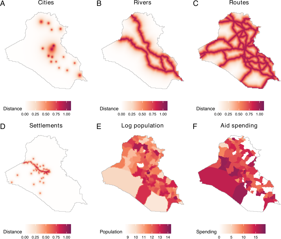
Transforming Non-Spatial Covariates
The remaining covariates are non-spatial ones. We include time splines and an indicator for a surge of airstrikes. Time splines can be acquired as follows.
time_splines <- splines::ns(1 : nrow(dat_hfr), df = 3)
dat_hfr$time_1 <- time_splines[, 1]
dat_hfr$time_2 <- time_splines[, 2]
dat_hfr$time_3 <- time_splines[, 3]
We can obtain an indicator for a surge as follows.
min_s <- as.numeric(as.Date("2007-03-25") - min(airstr$date) + 1)
max_s <- as.numeric(as.Date("2008-01-01") - min(airstr$date) + 1)
dat_hfr$surge <- ifelse(dat_hfr$time >= min_s & dat_hfr$time <= max_s, 1, 0)
Finally, since we do not have 30-day histories for the first 30 rows of the dat_hfr hyperframe, we remove these rows before analysis.
dat_hfr <- dat_hfr[31:499, ]Estimation of Causal Effects
We begin by estimating propensity scores using spatial covariates that were acquired in the first step above. We then estimate causal effects by specifying various spatio-temporal counterfactual scenarios.
Step 1. Estimating propensity scores
Acquiring the density of observed treatment data
To estimate propensity scores, we use the get_obs_dens() function. This function fits an inhomogeneous Poisson point process model using the mppm() function of the spatstat.model package. Similarly to the image covariates (see Appendix for details), we set ndim = 256. This means that 256 x 256 grid cells are used for analyses. In the following example, we save the names of all covariates as rhs_var and then fit a Poisson point process model, with point patterns of airstrikes as a dependent variable and rhs_var as independent variables.
rhs_var <- c("pop", "rivers_dist", "routes_dist", "all_cities", "aid",
             "hist_airstr_1", "hist_airstr_7", "hist_airstr_30",
             "hist_allout_1", "hist_allout_7", "hist_allout_30",
             "hist_sof_1", "hist_sof_7", "hist_sof_30",
             "time_1", "time_2", "time_3",
             "settles_dist_1", "settles_dist_2", "settles_dist_3",
             "settles_dist_4", "settles_dist_5", "settles_dist_6",
             "settles_dist_7", "settles_dist_8", "settles_dist_9",
             "settles_dist_10", "settles_dist_11", "settles_dist_12",
             "settles_dist_13", "settles_dist_14", "settles_dist_15",
             "settles_dist_16", "settles_dist_17", "settles_dist_18",
             "surge")
obs_density <- get_obs_dens(dat_hfr, "Airstrike",
                            rhs_var, ndim = 256, window = iraq_window)
The summary() function returns coefficients for each covariate. The following output shows the first five coefficients.
head(summary(obs_density), n = 5)| Estimate | Std. Error | t value | Pr(>|t|) | |
|---|---|---|---|---|
| (Intercept) | -15.71799 | 1.10977 | -14.1632 | 1.606e-45 |
| pop | 0.04558 | 0.08777 | 0.5193 | 6.036e-01 |
| rivers_dist | 0.08926 | 0.47477 | 0.1880 | 8.509e-01 |
| routes_dist | -2.28376 | 0.78144 | -2.9225 | 3.473e-03 |
| all_cities | -0.20712 | 0.50738 | -0.4082 | 6.831e-01 |
To create plots for predicted counts and residuals, users can use the plot() function (see figure below, panels A and B). This function assists users in evaluating the appropriateness of the model. In our model, while there is a noticeable spike in airstrikes around day 300 that is not perfectly captured (gray lines, panel A), it is presumably due to variability. The plot() function generates a combined plot comparing actual and predicted counts, a residual plot, and a plot for the average residual field. By setting combined = FALSE, users can prevent the combination of these plots, producing three separate plots and a dataframe to generate them individually. The combined = FALSE option thus provides greater flexibility. In the example, we set combined = FALSE. We also save the three plots as plot_obs_comp (corresponding to the figure below, panel A), plot_obs_res (corresponding to panel B), and plot_obs_arf.
plot_obs <- plot(obs_density,
                 time_unit = "Days", combined = FALSE,
                 lim = c(-0.001, 0.001))

plot_obs_comp <- plot_obs$plot_compare
plot_obs_res <- plot_obs$plot_residual
plot_obs_arf <- plot_obs$plot_arf
Performing out-of-sample prediction
There are four diagnostic tests to examine the validity of the propensity score model. The first is the out-of-sample prediction. Performing out-of-sample predictions is beneficial both for deciding which covariates to include and for specifying propensity scores. Using the dx_outpred() function, users can perform out-of-sample predictions by subsetting a fraction of data to construct training and test sets. For instance, users can employ the first 80% of observations as a training set and fit the model. Our results show that the predicted counts do not vary substantively when we predict the number of treatment events using the first 80% of observations (see figure above, panels C and D).
obs_density_8 <- dx_outpred(dat_hfr, ratio = 0.8, "Airstrike",
                            rhs_var, ndim = 256, window = iraq_window)
plot_out8 <- plot(obs_density, time_unit = "Days", dens_2 = obs_density_8,
                  combined = FALSE)

plot_out8_comp <- plot_out8$plot_compare
plot_out8_res <- plot_out8$plot_residualggpubr::ggarrange(plot_obs_comp + ggtitle("Fitted"),
plot_obs_res + ylim(-80, 80) + ggtitle("Residual"),
plot_out8_comp + ggtitle("Fitted"),
plot_out8_res + ylim(-80, 80) + ggtitle("Residual"),
nrow = 1, labels = LETTERS)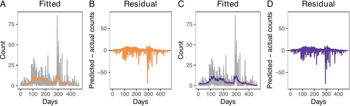
Visualizing average residual fields
The second test is a visual inspection of the average residual field, which represents the spatial residuals averaged across the entire study period. If the model accurately accounts for the spatio-temporal trends of treatment events, the resulting field should exhibit no significant local patterns or high-value clusters.
The get_obs_dens() function automatically obtains the average residual field. In our model, the average residual field does not exhibit local patterns or clusters (see the figure below).
plot_obs_arf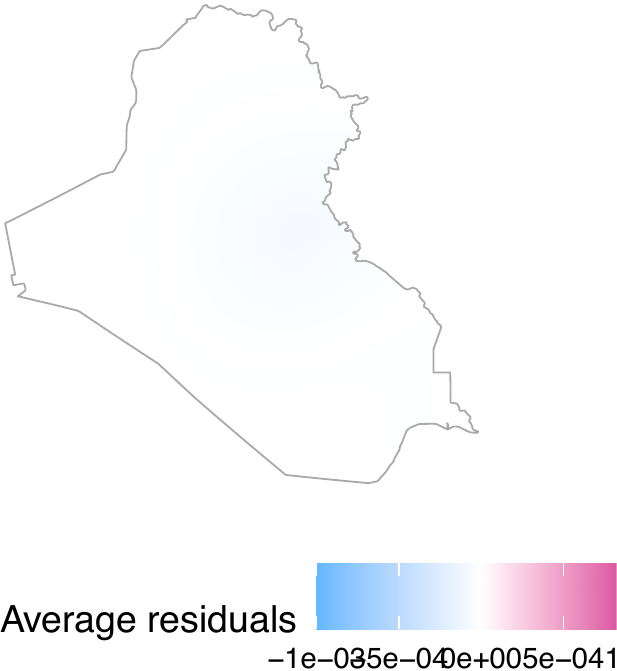
Performing the superthinning test
The third diagnostic test is the superthinning test (Schoenberg 2003; Clements, Schoenberg, and Veen 2012). The superthinning test provides a robust method for evaluating the validity of an inhomogeneous Poisson point process model. Following Schoenberg (2003) and Clements, Schoenberg, and Veen (2012), this approach selectively adds or removes points in areas of low or high intensity, respectively. The transformed point pattern follows a homogeneous Poisson process if and only if the inhomogeneous Poisson model accurately captures the underlying spatio-temporal trends. In our package, this test is implemented via the dx_supthin() function, which utilizes the same primary arguments as get_obs_dens(). By default, the function generates global envelopes based on 1,000 simulations and evaluates the results across a spatial range of 50 kilometers, though these parameters are fully customizable. As shown in the figure below, our model accurately captures the spatio-temporal trends.
supthin <- dx_supthin(dat_hfr, "Airstrike",
                      rhs_var, iraq_window)
plot_supthin <- plot(supthin)
plot_k <- plot_supthin$plot_k
plot_k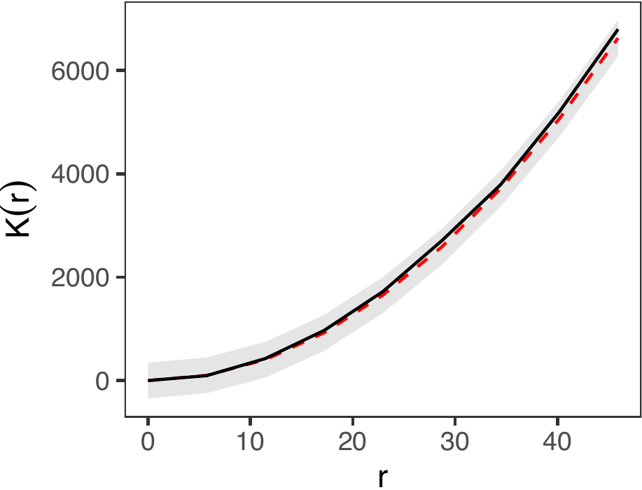
Inspecting the observed densities
Finally, we can visualize observed densities as image objects. To do so, users can use the plot() function by directly taking the output intens_grid_cells of the get_obs_dens() function (see figure below, displaying log densities), shown as follows. In this example, the 170th element of the observed density corresponds to day 200, as the first 30 days are omitted due to the absence of 30-day histories.
intens_grid_cells <- obs_density$intens_grid_cells

ggpubr::ggarrange(
  plot(intens_grid_cells, frame = 170, transf = log) + ggtitle("Day 200"),
  plot(intens_grid_cells, frame = 270, transf = log) + ggtitle("Day 300"),
  plot(intens_grid_cells, frame = 370, transf = log) + ggtitle("Day 400"),
  nrow = 1, labels = LETTERS, common.legend = TRUE, legend = "bottom")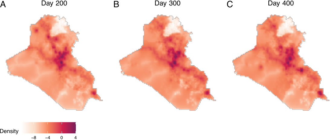
Step 2 Estimating causal effects
We next proceed to estimating causal effects by obtaining the baseline density, followed by specifying counterfactual densities, which can be approached in two ways. First, if users wish to change the expected number of treatment events while maintaining the spatial distribution of these events, they can obtain counterfactual densities by multiplying the baseline intensity with a positive constant. Second, if users aim to change both the expectation and the spatial density of treatment events, they can construct power densities before obtaining counterfactual densities. We illustrate both types of counterfactual scenarios.
Obtaining the baseline density
We obtain baseline densities using out-of-sample data. In the following example, we use the airstrikes_2006 dataset, an out-of-sample data representing airstrike locations in 2006, to acquire the baseline density using the get_base_dens() function (see figure below).
baseline <- get_base_dens(out_data = airstr_2006 |>
                            filter(type == "Airstrike"),
                          out_coordinates = c("longitude", "latitude"),
                          window = iraq_window, ndim = 256)
plot(baseline, main = "Baseline density", window = iraq_window,
     lim = c(0, 0.00014))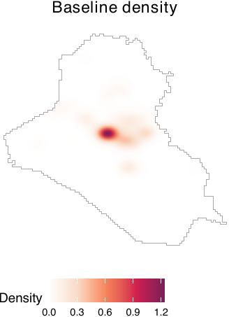
Specifying counterfactual densities: Changing the expectation
If users wish to examine how changes in the expected number of treatment events per period affect outcomes, they can construct counterfactual densities directly from the baseline density. For example, the following code compares a scenario with an average of one airstrike per day to one with six airstrikes per day.
cf_1 <- get_cf_dens(base_dens = baseline, expected_number = 1,
                    power_dens = NA, window = iraq_window)
cf_6 <- get_cf_dens(base_dens = baseline, expected_number = 6,
                    power_dens = NA, window = iraq_window)
For both of the two counterfactual densities, spatial distributions of airstrikes remain the same, but the expected numbers of airstrikes differ. To visualize these counterfactual densities, users can employ the plot() function (see figure below).
plot_cf1 <- plot(cf_1, main = "Counterfactual (1/day)",
                 lim = c(0, 8e-4))
plot_cf6 <- plot(cf_6, main = "Counterfactual (6/day)",
                 lim = c(0, 8e-4))
ggpubr::ggarrange(plot_cf1, plot_cf6, nrow = 1, labels = LETTERS,
                  common.legend = TRUE, legend = "bottom")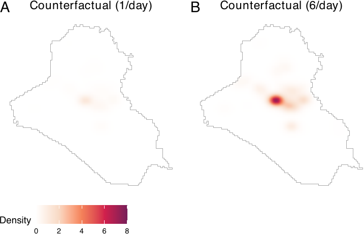
Specifying counterfactual densities: Shifting locations
If users wish to modify both the expected number and the spatial distribution of airstrikes, they must construct a power density. Power densities can be derived by combining multiple image objects, such as distances from major cities or roads, and allow users to generate counterfactual scenarios that prioritize certain locations over others. For illustration, we use distances from two major cities in Iraq—Baghdad and Basrah. The sample code demonstrates how to compute distances from these cities and construct a corresponding power density, yielding image objects that emphasize areas closer to each city.
To obtain power densities, users need to first acquire distances from Baghdad and Basrah using the get_dist_focus() function. We convert raw distances by applying exponential decay functions and dividing them by normalizing constants. In this paper, the distance metrics are also normalized by a conversion factor of 111.3195 to represent distances in degree-equivalents in order to ensure consistency with the spatial unit scale used by Papadogeorgou et al. (2022). Users may bypass this procedure.
dist_from_baghd <- get_dist_focus(window = iraq_window, ndim = 256,
                                  lon = 44.366, lat = 33.315)
dist_baghd <- exp(-dist_from_baghd / conversion_factor) /
  spatstat.univar::integral(exp(-dist_from_baghd / conversion_factor))

dist_from_basra <- get_dist_focus(window = iraq_window, ndim = 256,
                                  lon = 47.779, lat = 30.529)
dist_basra <- exp(-dist_from_basra / conversion_factor) /
  spatstat.univar::integral(exp(-dist_from_basra / conversion_factor))
Users then obtain power densities by employing the get_power_dens() function. Notice that the priorities argument of the get_power_dens() function corresponds to the \(\alpha\) parameter in the power density equation.
power_baghd <- get_power_dens(target_dens = list(dist_baghd, dist_basra),
                              priorities = c(2, 0), window = iraq_window)
power_basra <- get_power_dens(target_dens = list(dist_baghd, dist_basra),
                              priorities = c(0, 2), window = iraq_window)
Let us visualize power densities. We see that two cities are prioritized than other areas (see figure below, panels A and B).
plot_pbag <- plot(power_baghd, main = "Power density (Baghdad)",
                  lim = c(0, 3e-04))
plot_pbas <- plot(power_basra, main = "Power density (Basrah)",
                  lim = c(0, 3e-04))
ggpubr::ggarrange(plot_pbag, plot_pbas, nrow = 1, labels = LETTERS,
                  common.legend = TRUE, legend = "bottom")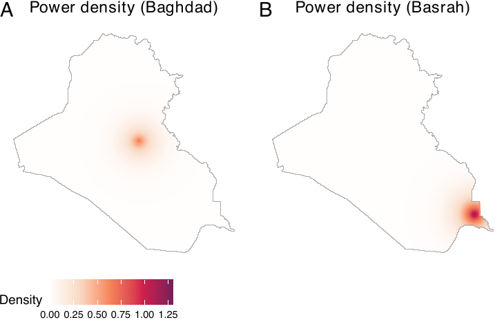
Users can now produce counterfactual densities. In the following example, we present two distinct counterfactual scenarios. The first envisions a scenario where the expected count of treatment events stands at 5 with a focus on Baghdad. Conversely, the second projects a scenario with an expected count of 5, emphasizing Basrah (in southern Iraq).
cf_baghd <- get_cf_dens(base_dens = baseline, expected_number = 5,
                        power_dens = power_baghd, window = iraq_window)
cf_basra <- get_cf_dens(base_dens = baseline, expected_number = 5,
                        power_dens = power_basra, window = iraq_window)
By visualizing the two counterfactual densities, we see that they reflect both the baseline density and power densities (see figure below, panels A and B).
plot_cfbaghd <- plot(cf_baghd, main = "Counterfactual (Baghdad)", lim = c(0, 8e-04))
plot_cfbasra <- plot(cf_basra, main = "Counterfactual (Basrah)", lim = c(0, 8e-04))
ggpubr::ggarrange(plot_cfbaghd, plot_cfbasra, nrow = 1, labels = LETTERS,
                  common.legend = TRUE, legend = "bottom")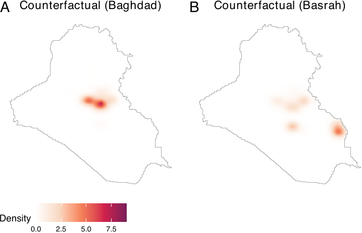
Assessing the effect of prioritization
To assess how location prioritization shapes power and counterfactual densities, the geocausal package provides functions for visualizing both. Users can vary \(\alpha\) in sim_power_dens() to plot power densities under different prioritization schemes, and use sim_cf_dens() to examine the resulting counterfactual densities (see figure below). Together, these tools help users select an appropriate value of \(\alpha\).
For example, we vary \(\alpha\) from 1 to 3.5 using distances from Basrah to assess how different degrees of prioritization affect counterfactual densities. We visualize these effects by generating power densities with sim_power_dens() and passing them to sim_cf_dens(). The figure below shows that as \(\alpha\) increases, counterfactual densities place progressively greater weight on locations closer to Baghdad.
sim_power_baghd <- sim_power_dens(target_dens = list(dist_basra),
                                  dens_manip = dist_baghd,
                                  priorities = 1,
                                  priorities_manip = c(1, 1.5, 2, 2.5, 3, 3.5),
                                  window = iraq_window)

sim_cf_baghd <- sim_cf_dens(expected_number = 2,
                            base_dens = baseline,
                            power_sim_results = sim_power_baghd,
                            window = iraq_window)
plot(sim_cf_baghd)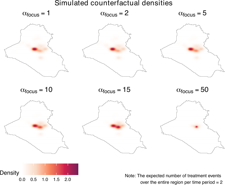
Interpreting counterfactual densities
Users can further interpret counterfactual densities using the get_distexp() function, which visualizes how different counterfactual scenarios affect the expected number of treatment events within areas defined by distance from specific locations, such as points (e.g., monuments) or lines (e.g., roads). The figure below shows that as \(\alpha_{\text{focus}}\) increases, the expected number of treatment events rises sharply, reflecting the increasing prioritization of areas near the focus relative to more distant locations.
expectation_baghd <- get_distexp(cf_sim_results = sim_cf_baghd,
                                 entire_window = iraq_window,
                                 dist_map = dist_from_baghd,
                                 use_raw = TRUE)
plot(expectation_baghd, use_raw = TRUE)
Obtaining causal contrasts
We now proceed to obtain causal contrasts. We employ the get_est() function to determine the effects of a counterfactual scenario (compared to another counterfactual scenario) on outcome events. Subsequently, we employ the summary() and plot() functions to summarize and visualize the causal effects. The print() function also prints the main results.
The get_est() function requires users to input the observed density (obs), two counterfactual densities (cf1 and cf2), treatment data (treat), smoothed outcome data (sm_out), the number of lags (lag, the number of time periods with a stochastic intervention), and geographical areas of interest. Users can also truncate weights by setting trunc_level.
To define geographical areas of interest, users can opt for either a distance map or a list of window objects. For instance, if users wish to estimate causal effects over areas within 100, 200, and 300 km from the center of a specific point, they can set use_dist = TRUE and provide a distance map (dist_map) along with sequences of distances (dist). Alternatively, if users aim to estimate causal effects within certain polygons (e.g., cities), this can be achieved by setting use_dist = FALSE and providing a list of owin objects (windows). In the following example, we employ distance maps to analyze causal effects of a scenario with six airstrikes per day compared to another with one airstrike per day, in areas within 100, 200, 300, 400, and 500 km from the center of Baghdad. Following Papadogeorgou et al. (2022), weights are truncated at the level of 95 percentiles. The outcome data of interest is SAF.
estimates1 <- get_est(obs = obs_density, cf1 = cf_1, cf2 = cf_6,
                      treat = dat_hfr$Airstrike,
                      sm_out = dat_hfr$smooth_SAF,
                      lag = 10, trunc_level = 0.95,
                      entire_window = iraq_window,
                      use_dist = TRUE, dist_map = dist_from_baghd,
                      dist = seq(100, 500, by = 100))
Using the summary() function, users can summarize the causal contrasts. The result output from the summary() function provides a summary of the causal contrasts, along with the upper and lower bounds of the 90% and 95% confidence intervals. These intervals are calculated using the variance upper bounds.
summary_est1 <- summary(estimates1)
summary_est1$result| window | point_estimate | upper_95 | lower_95 | upper_90 | lower_90 |
|---|---|---|---|---|---|
| 1 | 14.14543 | 23.12661 | 5.164252 | 21.68321 | 6.607656 |
| 2 | 16.02236 | 26.04446 | 6.000257 | 24.43377 | 7.610952 |
| 3 | 16.90254 | 27.36925 | 6.435830 | 25.68710 | 8.117980 |
| 4 | 18.84488 | 30.70058 | 6.989181 | 28.79520 | 8.894561 |
| 5 | 19.05863 | 31.10201 | 7.015237 | 29.16647 | 8.950781 |
| 6 | 19.06915 | 31.12184 | 7.016455 | 29.18480 | 8.953495 |
The same summary table can be obtained by employing the print() function as well.
print(estimates1)The results show that we observe more outcome events (insurgent attacks) under cf2 than under cf1.
Similarly, the causal effects that compare the scenario prioritizing Basrah to the one prioritizing Baghdad can be obtained by the provided code below.
estimates2 <- get_est(obs = obs_density, cf1 = cf_baghd, cf2 = cf_basra,
                      treat = dat_hfr$Airstrike,
                      sm_out = dat_hfr$smooth_SAF,
                      lag = 10, trunc_level = 0.95,
                      entire_window = iraq_window,
                      use_dist = TRUE, dist_map = dist_from_baghd,
                      dist = seq(100, 500, by = 100))
print(estimates2)| window | point_estimate | upper_95 | lower_95 | upper_90 | lower_90 |
|---|---|---|---|---|---|
| 1 | -14.61208 | -4.330037 | -24.89412 | -5.982508 | -23.24165 |
| 2 | -16.21231 | -4.703112 | -27.72150 | -6.552804 | -25.87181 |
| 3 | -16.94608 | -4.892682 | -28.99949 | -6.829836 | -27.06233 |
| 4 | -17.45463 | -4.137547 | -30.77172 | -6.277793 | -28.63148 |
| 5 | -17.93696 | -4.306629 | -31.56730 | -6.497218 | -29.37671 |
| 6 | -17.97079 | -4.322521 | -31.61906 | -6.515993 | -29.42559 |
The plot() function creates two plots. The first plot shows changes in the estimated intensity (see figure below, panel A), which summarizes the geographical areas where an increase (red) or decrease (blue) in outcome events is observed. The second plot provides a summary of the causal effects (see figure below, panel B). Panels C and D exhibit the causal contrasts comparing scenarios prioritizing Baghdad and Basrah. By default, the plot() function produces only a summary of the causal effects (panels B and D). By setting surface = TRUE, users can produce the surface plot (panels A and C) as well. In the following example, we set surface = TRUE.
plot_est1 <- plot(estimates1, surface = TRUE, lim = c(-6e-3, 6e-3))
plot_est2 <- plot(estimates2, surface = TRUE, lim = c(-6e-3, 6e-3))

plot_est1_surf <- plot_est1$surface
plot_est1_exp <- plot_est1$expectation
plot_est2_surf <- plot_est2$surface
plot_est2_exp <- plot_est2$expectation

ggpubr::ggarrange(plot_est1_surf + ggtitle("Changing expectations"),
                  plot_est1_exp + ggtitle("") + ylim(0, 40) +
                    scale_x_discrete(labels = c("100km", "200km", "300km",
                                                "400km", "500km", "Entire Iraq")),
                  plot_est2_surf + ggtitle("Shifting locations"),
                  plot_est2_exp + ggtitle("") + ylim(-40, 0) +
                    scale_x_discrete(labels = c("100km", "200km", "300km",
                                                "400km", "500km", "Entire Iraq")),
                  labels = LETTERS, widths = c(1.2, 2))
The causal contrasts comparing scenarios with different expected numbers of airstrikes replicate the results by Papadogeorgou et al. (2022). Readers should note that, in this paper, we included an indicator for a surge of airstrikes, we used a different version of the spatstat package, and we project the location information. The result shows that increasing the expected number of airstrikes results in increased insurgent activities. Shifting the focus from Baghdad to Basrah while maintaining a constant number of airstrikes results in a decrease in insurgent activities.
Performing heterogeneity analysis
Finally, let us consider heterogeneous effects. The estimated causal effects shown in the previous sections provide a summary measure of the airstrikes’ impact on insurgent activities over the entire Iraq. However, it is also important to understand how the causal effect varies over locations with different attributes. For example, one may expect that the locations with and without foreign aid will respond differently to an increase in airstrikes.
As developed in Zhou et al. (2025), the analysis of heterogeneous treatment effects proceeds in four steps: (1) partitioning the region of interest into pixels, (2) assigning a value of the moderator to each pixel, (3) estimating treatment effects at the pixel level, and (4) assessing how treatment effects vary with the moderator. We implement this procedure using the get_cate() function. Although the analytical framework involves four distinct steps, the geocausal package allows users to supply the necessary inputs directly to get_cate(). Because most inputs overlap with those required by get_est(), users can focus primarily on computing the number of outcome events in each pixel (corresponding to steps 1 and 2) and specifying the functional form of the outcomes (corresponding to step 3).
Most arguments of the get_cate() function are the same as those of the get_est() function. For example, the get_cate() function requires users to input the observed density (obs), two counterfactual densities (cf1 and cf2), treatment data (treat), the number of lags (lag), geographical areas of interest (entire_window), and the truncation level on weights (trunc_level). One of the few differences is that, in heterogeneity analysis, we do not employ the smoothed outcomes. Instead, we use the number of events in each pixel (pixel_count_out). Users can compute this quantity by employing the pixel_count_ppp() function. The pixel_count_ppp() function requires the outcome data (data) and the dimension of the pixel grid (ngrid) as inputs. If ngrid is not given, the function will use the default value, which considers a 128 x 128 grid. As an illustration, we obtain the number of SAF insurgent activities in each pixel as follows.
dat_hfr$pixel_count_SAF <- pixel_count_ppp(data = dat_hfr$SAF, ndim = 256)Another difference is that the get_cate() function requires users to input arguments about the regression model. Users can specify the form of the regression model by either constructing a matrix of moderators or letting the get_cate() function generate a moderator matrix by specifying arguments about spline basis functions. The get_cate() function generates a moderator matrix based on natural cubic splines or B-splines. If users wish to use other types of splines, they need to construct a moderator matrix on their own before applying the get_cate() function. We illustrate these two ways through examples below on binary and continuous aid variables.
Consider the first approach of constructing a moderator matrix using the get_cate() function. To employ this approach, users need to specify the following arguments of this function: a moderator matrix (E_mat), the indicator for including an intercept in the regression model (intercept), a vector of values on which the CATE will be estimated (eval_values), and the matrix corresponding to values in eval_values (eval_mat). When constructing a moderator matrix, the first step is to convert the moderator data, which is usually a column of a hyperframe, to a vector by using the get_em_vec() function. In our illustration, we consider the indicator for receiving foreign aid, and we can get the vector for the binary aid using the following code.
em_vec <- get_em_vec(dat_hfr$aid, time_after = TRUE, lag = 10)
em_vec <- em_vec > 0
Since the effect modifier is binary, let us consider the following regression model:
\[ \tau^{\mathrm{Proj.}}_{t,\boldsymbol{h}',\boldsymbol{h}''}(r; \boldsymbol{\beta}_t) = \beta_{t,0}+\beta_{t,1}r \]
Then, in this case, we need to construct the moderator matrix by converting the vector for the moderator to a matrix. Note that the moderator matrix passed to E_mat should not contain a column for intercepts. This means that we do not add a column of \(1\)s. Therefore, to obtain the moderator matrix, we can implement the following code. The E_mat presented below is used as an input for the eval_mat argument of the get_cate() function.
E_mat <- matrix(em_vec, ncol = 1)Since the argument eval_values of the get_cate() function represents possible values of the elements of E_mat, the input into eval_values should be a vector of 0 and 1. Given these quantities, users can perform heterogeneity analysis by using the following code.
cate1 <- get_cate(obs = obs_density, cf1 = cf_1, cf2 = cf_6,
                  treat = dat_hfr$Airstrike,
                  pixel_count_out = dat_hfr$pixel_count_SAF, lag = 10,
                  trunc_level = 0.95, time_after = TRUE, entire_window = iraq_window,
                  E_mat = E_mat, intercept = TRUE,
                  eval_mat = matrix(c(0, 1), ncol = 1), eval_values = c(0, 1))
The summary() function provides the estimates for the average regression coefficients over time, i.e., \(\beta_0 = \frac{1}{T-M+1}\sum_{t=M}^T\beta_{0,t}\) and \(\beta_1 = \frac{1}{T-M+1}\sum_{t=M}^T\beta_{1,t}\), along with the lower bound and upper bound of corresponding confidence intervals.
summary_cate1 <- summary(cate1)
summary_cate1$result_betas| point_estimate | upper_95 | lower_95 | upper_90 | lower_90 | |
|---|---|---|---|---|---|
| intercept | 0.00005 | 0.00010 | 0.00001 | 0.00009 | 0.00001 |
| basis_1 | 0.00067 | 0.00111 | 0.00024 | 0.00104 | 0.00031 |
The summary output also shows the estimates and confidence intervals for CATE evaluated on values in eval_values.
summary_cate1$result_values| values | point_estimate | upper_95 | lower_95 | upper_90 | lower_90 |
|---|---|---|---|---|---|
| 0 | 0.00005 | 0.00010 | 0.00001 | 0.00009 | 0.00001 |
| 1 | 0.00073 | 0.00119 | 0.00027 | 0.00111 | 0.00034 |
The print() function can produce the same summary table of CATE evaluated on values in eval_values.
print(cate1)Here the result shows that areas with aid (values = 1) observe a greater increase in the number of SAF events when the expected number of airstrikes increases from \(1\) per day to \(6\) per day in the previous 10 days, compared to regions without aid. The summary output also includes the result of a Chi-squared test, which tests the null hypothesis that all the coefficients except the intercept equal to \(0\). The result can be found by implementing the following code.
summary_cate1$chisq_test| chisq_stat | p.value | significance_level | reject |
|---|---|---|---|
| 9.08568 | 0.00258 | 0.05 | TRUE |
The results show that we will reject the null hypothesis at the 0.05 significance level and conclude that heterogeneity effect does exist for different values of (binary) aid.
What if we have non-binary moderator, such as ones with continuous values? Many attributes of a location have continuous values, for example, the distance to settlements, population density, distance to the nearest airstrike and alike. In the following example, we consider the log population as an effect modifier, and analyze how causal effects of airstrikes on SAF vary in areas with different population density values. Here, the log population density is time-invariant, but users can apply the same method for continuous and time-variant variables.
Consider the following model:
\[ \tau^{\mathrm{Proj.}}_{t,\boldsymbol{h}',\boldsymbol{h}''}(r;\boldsymbol{\beta}_t) = \sum_{l=0}^5 \beta_{t,l}z_{l}(r) \]
where \(z_{0},\dots z_{5}\) are natural cubic spline bases of the log population density. The get_cate() function can generate the moderator matrix when all the basis functions \(z_1(r),\dots,z_L(r)\) are natural cubic splines or B-splines. Thus, in this case, users do not need to construct the moderator matrix by themselves. Instead, users need to specify the number of spline basis functions (nbase), the type of the spline (type_spline, which should be either "ns" or "bs", which represents natural cubic splines and B-splines, respectively), the indicator for including an intercept (intercept), effect modifier values (em), and values on which the CATE will be evaluated (eval_values). The em vector can be computed in the same way as in the previous example. According to the equation above, there are six basis functions, and thus we use nbase = 6 in this case. With these specifications, users can run the following code to estimate the CATE.
cate2 <- get_cate(obs = obs_density, cf1 = cf_1, cf2 = cf_6,
                  treat = dat_hfr$Airstrike,
                  pixel_count_out = dat_hfr$pixel_count_SAF, lag = 10,
                  trunc_level = 0.95, time_after = TRUE, entire_window = iraq_window,
                  em = dat_hfr$pop, intercept = TRUE,
                  nbase = 6, spline_type = "ns",
                  eval_values = seq(10, 13, length.out = 20))
Similarly to the previous example, users can employ the summary() function to generate a summary of the estimates for regression coefficients, CATE, and test whether there exist heterogeneous effects.
summary_cate2 <- summary(cate2)
summary_cate2$result_betas
head(summary_cate2$result_values, 6)
summary_cate2$chisq_testsummary_cate2$result_betas:
| point_estimate | upper_95 | lower_95 | upper_90 | lower_90 | |
|---|---|---|---|---|---|
| intercept | -0.00067 | -0.00010 | -0.00124 | -0.00019 | -0.00115 |
| basis_1 | -0.00095 | -0.00033 | -0.00157 | -0.00043 | -0.00147 |
| basis_2 | 0.00468 | 0.00792 | 0.00143 | 0.00740 | 0.00195 |
| basis_3 | -0.00639 | -0.00188 | -0.01091 | -0.00260 | -0.01018 |
| basis_4 | 0.01477 | 0.02507 | 0.00447 | 0.02342 | 0.00613 |
| basis_5 | 0.02385 | 0.04033 | 0.00737 | 0.03768 | 0.01002 |
head(summary_cate2$result_values, 6):
| values | point_estimate | upper_95 | lower_95 | upper_90 | lower_90 |
|---|---|---|---|---|---|
| 10.00000 | 0.00008 | 0.00014 | 0.00001 | 0.00013 | 0.00002 |
| 10.15789 | -0.00016 | -0.00005 | -0.00026 | -0.00007 | -0.00024 |
| 10.31579 | -0.00044 | -0.00014 | -0.00074 | -0.00019 | -0.00069 |
| 10.47368 | -0.00066 | -0.00020 | -0.00111 | -0.00027 | -0.00104 |
| 10.63158 | -0.00068 | -0.00020 | -0.00115 | -0.00028 | -0.00108 |
| 10.78947 | -0.00043 | -0.00011 | -0.00075 | -0.00016 | -0.00070 |
summary_cate2$chisq_test:
| chisq_stat | p.value | significance_level | reject |
|---|---|---|---|
| 12.62539 | 0.02715 | 0.05 | TRUE |
The test results indicate that the causal effects vary across areas with different log population values. The plot() function can be used to visualize the estimated CATE (see figure below). This function generates a plot that exhibits the estimated CATE and corresponding 95% confidence intervals. Users can choose to visualize the CATE as a dot plot with error bars (type = "p") or a line plot which shaded region (type = "l"). As an illustration, in the figure below, we employ type = "p" for the binary aid and type = "l" for the log population density values. The estimated CATE is a pixel effect, and users can scale this value by a positive value specified by argument scale. In the examples, we scale the CATE by the average number of pixels in a district, calculated as the number of pixels in the Iraq window divided by the number of districts, to show the average district-level effect. While the plot() function generates plots exhibiting the estimated CATE by default, users can also visualize estimated regression coefficients by setting result = "beta".
n_district <- length(iraq_district$ADM3NAME)
avg_pixels_per_district <- sum(!is.na(dat_hfr$pixel_count_SAF[[1]]$v),
                               na.rm = TRUE)/n_district
plot_cate1 <- plot(cate1, type = "p", scale = 81)
plot_cate2 <- plot(cate2, type = "l", scale = 81)
ggpubr::ggarrange(plot_cate1 + ggplot2::xlab("Aid"),
                  plot_cate2 + ggplot2::xlab("Log population"),
                  labels = LETTERS, widths = c(1.2, 1.8))
According to the figure above, when the number of airstrikes increases during the previous 10 days, the number of insurgent attacks (SAF) increases in areas with and without aid. However, areas receiving aid tend to exhibit a stronger response to the treatment. Furthermore, the expected change in the number of insurgent activities is negative in areas with a log population density less than 11 and greater than 12, but positive in areas with a log population density between those values.
Citation
If you use geocausal in your research, please cite:
@article{mukaigawara2024geocausal,
  title={geocausal: An R Package for Spatio-Temporal Causal Inference},
  author={Mukaigawara, Mitsuru and Zhou, Lingxiao and Papadogeorgou, Georgia and Lyall, Jason and Imai, Kosuke},
  journal={OSF Preprints},
  year={2024},
  doi={10.31219/osf.io/5kc6f}
}
References
Clements, Robert Alan, Frederic Paik Schoenberg, and Alejandro Veen. 2012. “Evaluation of Space-Time Point Process Models Using Super-Thinning.” Environmetrics (London, Ont.) 23 (7): 606–16.
Papadogeorgou, Georgia, Kosuke Imai, Jason Lyall, and Fan Li. 2022. “Causal Inference with Spatio-Temporal Data: Estimating the Effects of Airstrikes on Insurgent Violence in Iraq.” Journal of the Royal Statistical Society, Series B (Statistical Methodology) 84: 1969–99. https://doi.org/10.1111/rssb.12548.
Schoenberg, Frederic P. 2003. “Multidimensional Residual Analysis of Point Process Models for Earthquake Occurrences.” Journal of the American Statistical Association 98 (464): 789–95.
Zhou, Lingxiao, Kosuke Imai, Jason Lyall, and Georgia Papadogeorgou. 2025. “Estimating Heterogeneous Treatment Effects for Spatio-Temporal Causal Inference.” Working Paper. https://doi.org/10.48550/arXiv.2412.15128.